
To help you become a top-notch presenter, we’ll show you how to use our Results Dashboards feature. It allows you to create a survey results report, where you can present the results visually, and add text alongside any visual for additional context. You’ll also be able to pick and choose the questions you want to use, and decide where to drag and drop each visual so that the dashboard looks the way you want.
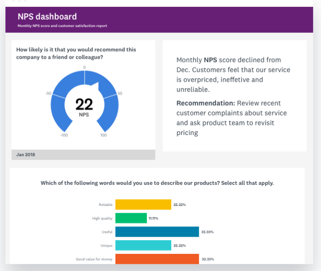
The result is a nifty page that breaks down your survey results in an easily digestible format. Here’s an example of how it could turn out:
Discover more ways to use our Results Dashboards
From surveying customers to collecting employee feedback, use our feature to show the results of any survey.
Now that you’re feeling jazzed about the feature, let’s walk through how you can use it, and go over some tips and tricks on how to present survey results!
The 5 steps for creating a survey results report
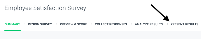
1. Click on the “Present Results” tab in your survey homepage.
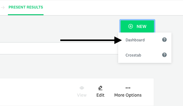
2. Select the “New Dashboard” button at the center of the page or click “New” and then “Dashboard.”
3. SurveyMonkey will automatically send you to the Analyze tab of your survey to identify questions you’re interested in adding to your dashboard. While you’re in the Analyze tab, feel free to apply any filters you’d like and customize your charts so they display what you want to share (we’ll review this more in the next section). Once you’re happy with how a chart looks, you can add it to your dashboard by clicking the thumbtack icon on the upper-right of the chart.

4. Go back to your “Present Results” tab. You should see all of the charts and open-ended questions you added in boxes (we call them cards). You can add text below or next to any card and change the position of any card by simply dragging and dropping it.
5. All that’s left to do is share your survey results report! Click “Publish.” You can then create a link for sharing it, and, depending on your plan, add an extra layer of security by making the link password-protected.
Note: There are certain types of questions you can’t add to dashboards. Learn about these question types and the other incompatible settings for dashboards by reviewing the “Unsupported Questions” section in our help center article.
Tips: How to present a Results Dashboard like a pro
Setting up your dashboard is just the beginning. Here’s what you’ll need to do to turn it into an accessible and insightful survey results report:
1. Create separate dashboards for different teams.
Think through the different teams or individuals you plan to present the data to. They’re likely to care about different questions and audiences. You can account for their individual needs and wants by filtering your data before you add questions to each dashboard.
For example, say you surveyed employees to gauge how happy they are at work. The leaders of individual departments care more about what employees in their departments said. To give them the information they want, filter your results by the appropriate department before you begin adding anything to their dashboard.
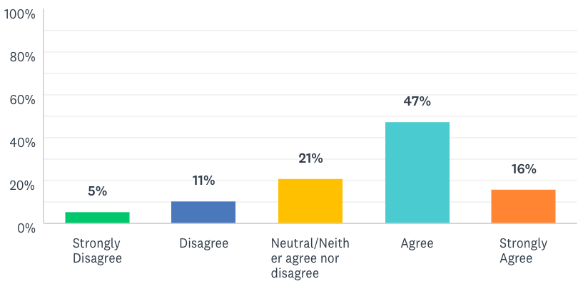
2. Make your charts more accessible and attractive.
Here are some ideas:
- Add data points onto your chart (they’ll appear as either percentages or response counts). This can help remove any ambiguity in the numbers each bar or slice represents.
- Remove decimal points. Decimal points are unlikely to add any useful information to your chart and they make it harder to read.
- Customize the colors of each bar or slice. Customized colors can help distinguish each component of your chart, but you can also use them to match your organization’s branding.
The resulting chart can look something as follows:
Learn more about how you can customize your charts.
3. Use text sparingly in your dashboard.
Only add comments alongside your charts or open-ended response slides when you want to add additional context or your opinions. This can include the reasons why the responses look a certain way or your recommendations for improving certain pieces of feedback. For any comment you make, make sure it’s concise so that it doesn’t overwhelm or distract your colleagues.
Your team wants to receive feedback quickly, but they also want it presented in a way that’s clear and relevant to their needs. To help you present the survey data successfully with each team, you can lean on our Results Dashboards. As you now know, the feature allows you to create several custom reports that allow different teams to understand their target audience and make decisions that are in the respondents’ best interests.